Geographic Information Systems — Fall 2025
Explore student work showcasing GIS concepts through interactive maps and data visualizations using ArcGIS StoryMaps.
Overview
In the Fall 2025 semester, students in the Geographic Information Systems (CUSP-GX 5053) course led by Industry Assistant Professor Anton Rozhkov developed ArcGIS Storymaps reports.
Throughout the latter part of the semester, teams had the opportunity to dedicate several weeks to the development of research questions, exploration of their chosen topics to solve real-world problems, and the utilization of GIS tools to address these inquiries. Students were not only encouraged but also empowered to employ a variety of analytical techniques and tools covered in the course. These encompassed geoprocessing tools such as buffer, clip, intersect, geocoding, working with rasters, density heatmaps, interpolation, table and spatial joins, data management, and more. Additionally, emphasis was placed on the skillful use of symbology, labeling, color selection, map projection, and layout design.
The culmination of their efforts resulted in a compelling ArcGIS Storymap report. Within this report, maps and supplementary information were ingeniously employed to illustrate methodologies and effectively communicate their findings. A heartfelt appreciation goes out to all the students for their unwavering dedication and hard work throughout the semester.
Mapping NYC's Crisis Management System
Author: Gianna Campa
Link to the ArcGIS StoryMap.
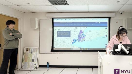
This project examines how New York City’s Crisis Management System (CMS), a network of community violence intervention (CVI) programs formalized in 2013, can be evaluated through a spatial, equity-centered lens. It frames gun violence as a persistent, highly concentrated public safety and public health issue that intersects with systemic racism and the localized harms of mass incarceration, particularly for Black communities. Building on prior GIS-based evaluations by the NYC City Council (showing reductions in shootings in Cure Violence precincts after implementation) and the NYC Comptroller’s 2025 report (finding CMS catchment areas experienced lower-than-expected gun violence but noting major evaluation gaps), the project proposes a prototype approach to identify service gaps and prioritize expansion. Using NYC Open Data shooting incidents (2025 YTD), police precinct boundaries, census-tract poverty measures, and Neighborhood Development Areas (NDAs) as a proxy for poverty-targeted support, the analysis creates two indices, resource need (poverty + NDA status) and shooting density (per-capita shootings), and combines them into a standardized CMS Site Need Index weighted toward gun violence. Multi-ring buffers (0.5 and 1 mile) around CMS sites, then classify high-need precincts by proximity to existing services. The results highlight multiple precincts with high need but no dedicated CMS presence, including precincts identified as out of reach of current sites (e.g., 7 and 14) and others that appear feasible for lower-cost service expansion based on walkable distance thresholds. The StoryMap concludes with limitations (notably, preliminary service-type classification and a single-year snapshot) and outlines future directions for a more holistic, multi-year, public-health-aligned framework with improved data standardization, differentiated service-area logic by CVI model type, and public-facing tools to support coordination and accountability.

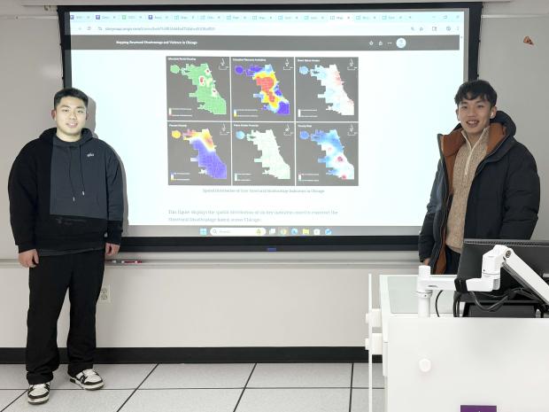
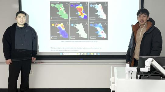
Mapping Structural Disadvantage and Violence in Chicago
Authors: Guanyu Chen, Shangyu Yang
This project uses GIS to examine how structural disadvantage is patterned across Chicago and how it relates spatially to homicide incidents. The analysis constructs a Structural Disadvantage Index (SDI) by integrating six indicators that represent economic hardship, social marginalization, institutional access, housing conditions, and environmental amenities: poverty rate, minority concentration (computed as 1 − % Non-Hispanic White), education resource density (schools + libraries merged and summarized per area), affordable rental housing development counts, distance to the nearest police station, and green space access (park/garden presence plus total park area). All datasets are processed within a consistent geography (Chicago Community Areas) and projected to NAD 1983 StatePlane Illinois East to ensure accurate distance- and area-based calculations. Methodologically, point and polygon layers are summarized using spatial joins, density measures, nearest-distance analysis, and area calculations, then normalized so indicators can be compared on a common scale with a consistent “higher = more disadvantage” interpretation. To avoid arbitrary weighting, the project applies the Analytic Hierarchy Process (AHP): pairwise comparisons on the Saaty scale generate indicator weights via eigenvector normalization, and a consistency check confirms the logic of the weighting scheme. The weighted indicators are then combined using a weighted overlay to produce a continuous SDI surface. Results show strong clustering of high SDI on Chicago’s South and West Sides, and side-by-side mapping with homicides reveals substantial co-location of high disadvantage and high violence, alongside places where the patterns diverge, suggesting structural disadvantage is influential but not sufficient on its own to explain homicide intensity.
Mapping Ethnic Communities and Food Quality in Santa Barbara
Authors: Haodong Ren, Leyan Chen, Huayan Yu
This project uses GIS to explore how ethnic community patterns in Santa Barbara County relate to the spatial distribution of high-rated ethnic restaurants. Because ethnic boundaries are not directly observable, the project uses the dominant non-English language spoken at home (U.S. Census / NHGIS) as a tract-level proxy for ethnic community presence, then joins those attributes to 2022 census tract boundaries extracted for Santa Barbara County. Restaurant locations and cuisine categories come from the Yelp Open Dataset; the team merges multiple CSVs in Python, retains key fields, and filters to restaurants rated ≥ 4 stars before converting the table to a point layer using XY Table to Point. To improve interpretability, tracts are symbolized by dominant language and then dissolved by language to create contiguous “community areas.” Restaurants are mapped by cuisine type, and Select by Location is used to isolate tracts containing high-rated restaurants, followed by additional dissolves to compare restaurant presence within language-defined areas. The maps show Spanish-speaking areas as the most widespread, with smaller, localized clusters for Chinese, French/Haitian, and other Indo-European communities; restaurant points concentrate along the coastal corridor and downtown Santa Barbara (near major routes like US-101). Overall patterns suggest cultural alignment (e.g., Mexican/Spanish restaurants in Spanish-dominant areas) but also highlight how tourism, commercial corridors, and transportation accessibility shape where high-rated cuisine clusters appear.

NYC Climate Investments Compared to Sea Level Rise
Authors: Pascale Ergas, U.P. Nguyen, Zoe Tseng
This project uses GIS to ask whether NYC’s 2025 climate capital investments align with neighborhoods most vulnerable to sea level rise (SLR) and flooding. The team imported NOAA sea level rise vectors into ArcGIS Pro and overlaid three inundation scenarios (1.5 ft, 2.5 ft, 5.5 ft) with a TIGER ZIP Code shapefile to identify areas likely to be affected. They then joined and mapped two complementary vulnerability measures: NYC’s Flood Vulnerability Index (FVI, 1-5) and the CDC/ATSDR Social Vulnerability Index (SVI, 0–1), and built an interactive dashboard to “open up” SVI by visualizing race, education, and poverty at the ZIP level (including table cleaning, creating ZIP fields from geographic IDs, and majority-category field calculations in GIS/Python). Finally, they joined this risk picture to the city’s Climate Budgeting Report dataset (projects >$50k) to total 2025 investment amounts by neighborhood and compare the top investment neighborhoods (e.g., Gowanus, Hunts Point, Harlem, Red Hook, Coney Island, Gravesend) against their FVI/SVI scores. The key result is that investments are generally going to flood-vulnerable places, but funding levels do not scale with vulnerability rank (e.g., moderate-FVI areas can receive more than the highest-FVI neighborhoods), suggesting prioritization may reflect project type, feasibility, or neighborhood context rather than exposure alone. The authors note limitations from ZIP-code aggregation (masking within-ZIP variation), excluding many non-neighborhood-targeted investments (e.g., broad emergency response), and treating Staten Island as a special case, which may understate total spending benefiting the most exposed areas.
Fare Evasion Punishment in NYC
Authors: You Li, Keyang Yan, Lisette Gaxiola
This project uses GIS to examine how fare evasion enforcement severity in NYC, measured as the annual arrest-to-summons (A/S) ratio, varies across neighborhoods and how it relates to population, race/ethnicity, and income/poverty. The team compiled NYPD quarterly station-level fare evasion arrests and summonses for 2024 into a single cleaned table keyed by GTFS station identifiers, resolving null joins caused by stations with multiple platforms/line groups by restructuring rows and assigning consistent GTFS codes. They joined the cleaned enforcement table to an MTA subway station point shapefile, then used a spatial join to aggregate station enforcement totals to NYC neighborhoods (NTAs). A new field calculated the 2024 annual A/S ratio for each neighborhood as the primary outcome for mapping and comparison. Demographic and contextual layers (population totals/density, race composition, and a Racial Diversity Score based on Simpson’s Diversity Index, and poverty/income measures, plus parks) were then joined/overlaid to visually assess spatial co-patterns with enforcement severity. The maps show arrests clustering most strongly in parts of the Bronx and several Brooklyn neighborhoods (e.g., East New York/Flatbush areas, plus Harlem and Astoria relative to adjacent areas), while high-density Manhattan does not consistently show similarly high arrest ratios. Overall, the project finds the clearest spatial association between higher poverty rates and higher arrest-to-summons ratios, while population and racial diversity appear to relate more unevenly, suggesting enforcement severity likely reflects a combination of neighborhood conditions and policy/practice differences rather than a single driver.

Park Accessibility and Spatial Equity in San Francisco
Authors: Yan Li, Kailun Li
This project evaluates park accessibility and spatial equity in San Francisco using GIS at the Census Block Group scale, asking whether park resources are distributed fairly relative to population density and household income. Using a TIGER/Line block-group geometry and a polygon layer of local public parks, the workflow first resolves a key joining challenge by constructing an NHGIS-style GISJOIN field in the shapefile (via Python Field Calculator) to join NHGIS population and income tables consistently. Park access is measured with a 300-meter buffer around parks (walkable catchments), then Spatial Join/Intersect is used to identify block groups within reach. Equity metrics include population density (population/area) and park area per 1,000 residents, with an “underserved” flag defined as < 3 acres per 1,000 people; block groups are also compared by high vs. low income and high vs. low density using summary statistics. To detect systematic inequities, the project runs Local Moran’s I (LISA) on park area per capita using a k-nearest neighbors (k=8) spatial weights matrix, mapping Low-Low clusters as priority underserved zones. Results show that most residents are within 300 m of a park, but gaps remain at the western and southern edges; more importantly, several dense eastern and southeastern neighborhoods have low park area per person even when parks are nearby, forming Low–Low clusters that indicate persistent shortages. The study excludes national parks to focus on everyday neighborhood access and notes limitations from using Euclidean buffers (rather than network walking routes) and not capturing park quality or informal green spaces.

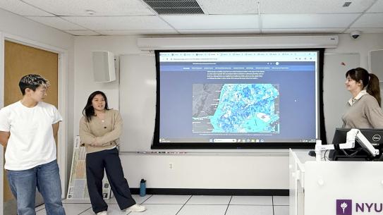
Understanding Spatial Inequities in NYC 311 Noise Complaints
Authors: Jiatong Yao, Yixin Tang, Mingda Wang
This project applies GIS to examine where NYC 311 noise complaints cluster and whether sustained complaint intensity overlaps with social vulnerability. The team converts 2020–2025 311 noise complaint records from CSV to point features using XY Table to Point, clips all layers to the NYC boundary, and joins complaint and demographic attributes to census tracts in a unified geodatabase. Complaint burden is mapped in two ways: (1) counts per 1,000 residents (points spatially joined to tracts, then normalized by ACS population) to reduce population-density bias, and (2) kernel density estimation (KDE) to represent complaints as a continuous surface that can cross administrative boundaries. KDE outputs are summarized back to tracts using zonal statistics (KDE mean) so they can be compared directly with census indicators. Bivariate mapping is used to visually compare complaint intensity with race composition, income, and education, emphasizing these as neighborhood context rather than individual reporting behavior. Finally, KDE mean is combined with the CDC/ATSDR Social Vulnerability Index (SVI) in a bivariate map to identify co-occurrence. Results show clear spatial clustering of complaints along dense urban corridors; hotspots and high KDE mean values overlap with high-SVI tracts especially in the Bronx, Upper Manhattan, and parts of Brooklyn, while Midtown/Lower Manhattan show high intensity with lower SVI. The comparison between KDE intensity and per-capita rates highlights that 311 data reflect both environmental conditions and socially patterned reporting, not measured noise exposure alone.
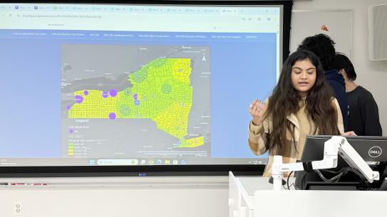
Recreation Need and Park Access in the Finger Lakes Region
Authors: Flandre Dong, Fangqi Chen, Han Xiao
This project uses county-scale GIS analysis to evaluate whether state/regional park supply meets recreation demand in New York’s Finger Lakes region and how equity factors (especially poverty) shape priority for investment. The workflow defines the 14-county study area in ArcGIS, then extracts OpenStreetMap park land use polygons within the region using Select by Location and filters them by size to focus on parks with regional significance (area > 0.5 km²), excluding small local green spaces. A spatial join links these qualifying parks to county boundaries to compute a county-level park supply count (nulls explicitly indicate counties with no qualifying parks). Recreation demand is incorporated by joining the Recreational Index of Need (RIN) to counties and creating RIN_Required (parks needed), then computing a recreation gap (RIN_Gap = RIN_Required − park supply). To add planning and equity context, ACS population (B01003) and ACS poverty (S1701) fields are joined to the county layer (with noted partial poverty coverage), and two priority indicators are constructed by weighting the same gap metric: population-weighted priority (gap x population) to reflect how many residents may be affected, and poverty-weighted priority (gap x poverty measure) to highlight places where lower-income residents may face greater barriers. Comparing these rankings identifies counties that consistently emerge as priorities (e.g., Monroe and Onondaga) and shows where equity-based priorities differ from population-driven ones. The project concludes that large-park resources are limited and uneven relative to need, while noting that results depend on thresholds (e.g., the 0.5 km² cutoff) and data availability and could be strengthened with finer-scale units and additional accessibility measures.

The Air Around Us
Authors: Srishti Ananya, Krishna Talluri, Tianze Liu
This project uses a multi-method GIS workflow to map Air Quality Index (AQI) patterns across New York State from 2020-2025 and show how interpretation changes depending on the spatial representation. Using daily AQI and pollutant observations from EPA AQS monitoring stations, the team first explains AQI construction (pollutant-specific AQI values via EPA breakpoints, with the daily AQI defined by the maximum/dominant pollutant), then analyzes spatial patterns through layered methods in ArcGIS Pro: IDW interpolation to convert point observations into continuous AQI surfaces, hexagonal binning to aggregate and compare exposure across uniform cells (reducing sensitivity to uneven station density), buffer analysis (5/10/15 miles) to visualize monitoring coverage and uncertainty gaps, and Voronoi/Thiessen polygons to assign areas of influence to each station and support population-normalized (“AQI per million”) comparisons. Across maps, typical urban–rural gradients persist (higher AQI around NYC and other metro/industrial corridors), but 2023 stands out as a statewide anomaly consistent with the Canadian wildfire smoke episode that elevated PM2.5 and pushed AQI higher even in normally cleaner regions. The project emphasizes that air-quality “hotspots” depend not only on pollution but also on monitor placement, aggregation choices, and extreme events, and it highlights key limitations such as urban-biased monitoring networks, reliance on maximum AQI values, and distance-based assumptions in interpolation during long-range smoke transport.
Market Analysis for Blank Street Coffee in Manhattan, NYC
Authors: Eunji Kim , Ayla Fish , Mengyang Yu
This project conducts a GIS-based site suitability / market analysis for expanding Blank Street Coffee in Manhattan, asking where new stores are most viable when balancing real-estate cost/size constraints, demand generators, mobility access, and competitive context. Using NYC DOF assessment/valuation data and MapPLUTO joined to Neighborhood Tabulation Areas (NTAs), the first strategy maps market value per square foot and filters candidate parcels that are ~50% below neighborhood average and match Blank Street’s small-footprint retail model (≈500-1,500 sq ft), producing a low-cost shortlist outside existing store buffers. Strategy 2 reframes expansion around university students by mapping universities, generating 5-minute walk service areas, intersecting them with subway station proximity buffers, and then using ArcGIS Suitability Analysis / Business Analyst enrichment to weight and score student-accessible, transit-oriented zones while excluding areas too close to current Blank Street locations. Strategy 3 tests an aggressive “compete where demand already exists” approach by building three standardized raster surfaces (competitor density (KDE), distance to subway (Euclidean distance), and distance-to-competitors gaps) then combining them via a weighted overlay (roughly prioritizing competitor intensity and spacing over transit) to extract the highest-scoring market-entry hotspots. Synthesizing results across all three strategies, the team identifies a small set of repeat high-suitability locations (with a final emphasis on the West Village), and argues that West 13th Street outperforms nearby alternatives when pairing model scores with street-level visibility and retail context. Key limitations noted are the reliance on static datasets (no time-of-day foot traffic, seasonality, or sales), and the opportunity to improve realism with network-based walking access and dynamic mobility or transaction data.

Resilience in the U.S. National Airspace
Authors: Nissim Ram, Michael Okoro, Matt Ghadimi
This project analyzes resilience and externalities in the U.S. National Airspace System by treating 51 major airports as a “closed” strategic network and examining how its topology, recovery patterns (2019–2024), and environmental/safety impacts concentrate across space. Using BTS T-100 domestic segment data (millions of records), the team builds annual origin-destination flow tables via Python ETL, then maps “trunk” flight corridors in ArcGIS Pro as geodesic network lines, applying an “anti-hairball” threshold (only routes above a high passenger cutoff) to reveal the backbone structure and how it collapsed in 2020, shifted toward Sunbelt leisure recovery in 2021, and reconfigured by 2024 with new high-volume corridors and greater redundancy through interior hubs. The project frames this as moving beyond “fortress hub” bias by emphasizing network centrality and mesh-like rerouting capacity, highlighting secondary hubs (e.g., SLC, CLT) as critical valves for system continuity. It then layers in noise and housing market impacts by overlaying federal noise rasters/contours around major metros (NYC, Chicago, Bay Area) with ZIP-level Zillow home values, observing spatial gradients where higher noise exposure often aligns with lower relative prices, while noting context-dependent “connectivity premiums” in high-demand regions. Finally, it evaluates wildlife strike safety by correcting “volume bias” (busy airports have more strikes) through hexagonal aggregation and normalization, revealing risk hotspots linked to broader ecological structures (e.g., flyways) rather than traffic alone. The conclusion argues the core network is operationally resilient, but environmental and safety burdens remain spatially concentrated, and it flags limitations (closed-system exclusion of feeder routes; coarse ZIP geography) while proposing future work that connects aviation exposure to equity and health (e.g., integrating environmental justice indicators).

Bodies Heal, Do Trains?
Authors: Calvin Kuhnen, Reese Conti, Abdul-Halim Hussein
This project analyzes how NYC subway ridership recovered after COVID-19 using station-complex tap-in data from 2020-2024, combining Python preprocessing with ArcGIS Pro mapping and animation. After cleaning and aggregating daily ridership, the team visualizes systemwide recovery through a time-enabled 3D animation and year-by-year maps that measure each station’s weekday ridership as a percentage of a pre-pandemic baseline (Jan-Feb 2020). The results show an uneven recovery pattern: major destination hubs tied to tourism and events (e.g., Times Square, Herald Square, Mets-Willets Point, JFK/Howard Beach) rebound to or above baseline, while many commuter-oriented areas—especially parts of the Bronx and some residential stations - remain well below pre-COVID levels. A supplemental population catchment comparison (1/4-mile census-tract aggregates) highlights that high-recovery stations often serve non-resident demand, reinforcing the interpretation that the strongest rebound reflects leisure travel and shifting activity patterns rather than a full return of traditional office commuting. Overall, the work demonstrates how spatial-temporal visualization can reveal a “Manhattan lag” alongside more resilient outer-borough travel, and it suggests operational implications such as prioritizing weekend/evening frequency in entertainment corridors, protecting long-haul express service, and minimizing disruptive maintenance on lines heavily relied on by essential workers.

Building Pipelines, Thinking Prisons
Author: Ritika Lal
Link to ArcGIS StoryMap.
Building Pipelines, Thinking Prisons: Tracking Aramco's Infrastructural Development of the 1950s
This project uses GIS and archival cartography to investigate why Hofuf (an older commercial center in Al-Hasa, Saudi Arabia) was chosen as the site where Aramco labor activists were imprisoned during the 1953 strike, despite Hofuf not being one of the main oil towns. By georeferencing a rare 1951 sketch map of Hofuf to approximate the prison’s location and then overlaying it with georeferenced regional maps from 1921 and 1952 showing caravan routes, oil installations, pipelines, and airbases, the analysis compares pre-oil and mid-century infrastructural geographies. The resulting distance and connectivity maps suggest that Hofuf’s relationship to Dhahran, Ras Tanura, and Abqaiq was not “natural” proximity but was newly produced through Aramco-era infrastructure, especially pipelines (and likely rail), which reoriented spatial imaginaries and practical mobility away from older trade routes. The project argues that this engineered connectivity helps explain Hofuf’s strategic role in repression: Aramco’s infrastructural expansion supported extraction while also enabling surveillance and carceral control, linking a historically dissenting region into the operational orbit of the oil camps. Limitations include georeferencing uncertainty, pixelated historical sources, and incomplete spatial detail for camps/fields, but the work demonstrates how GIS can make visible the political stakes embedded in seemingly technical infrastructure development.

Income-Based Equity in Subway and CitiBike Accessibility
Authors: Jerry Zhao, Haozheng Liu, Kaiwen Lin
Link to ArcGIS StoryMap.
Income-Based Equity in Subway and CitiBike Accessibility: A GIS Transportion Analysis of Manhattan and Brooklyn
This project evaluates income-based equity in everyday mobility access across Manhattan and Brooklyn by comparing walkable accessibility to MTA subway stations and Citi Bike docks at the census tract level. Using ArcGIS Pro, the team constructs multiple tract-level indicators: (1) the share of each tract covered by a 500-ft “walk access” service area to either mode (with overlap removed), (2) subway and Citi Bike station supply normalized per 1,000 residents, (3) a subway “LineScore” reflecting service richness based on how many lines serve nearby stations, and (4) Citi Bike network density measured by the number of other docks within 1,500 ft of each station as a proxy for last-mile flexibility. Results show that apparent physical coverage can mask inequality: many lower-income tracts are technically within short-distance buffers, but low per-capita station supply indicates higher crowding and weaker practical access. Higher-income tracts, especially in core Manhattan and parts of northwest Brooklyn, consistently show better redundancy, more stations per resident and denser Citi Bike networks, supporting more reliable transfers and “backup options” when stations are full or empty. The analysis also highlights a “hub illusion,” where some low-income areas score high on connectivity because they contain major transfer nodes, yet still experience low capacity and limited micromobility alternatives. The authors note key limitations of Euclidean buffers (vs. network walking distances) and the lack of Citi Bike capacity/availability data, but argue the multi-indicator GIS approach offers a clearer, more policy-relevant picture of transit equity than any single metric alone.

Why do New Yorkers value time over money?
Authors: Milka Vincentiya, Lochan Pranav M, Vaishnavi Potphode
Why do New Yorkers value time over money? The Economics of Proximity: Measuring the true value of being 'on the line.'
This project argues that in New York City, housing decisions reflect a deliberate tradeoff between money and time, where proximity to rapid transit functions like a purchasable amenity that reshapes “true affordability.” Using GIS, the team maps HUD’s Location Affordability Index components across NYC to compare annual housing costs, modeled transportation costs, and the share of commuters using transit, then synthesizes them into a combined Housing + Transportation (H+T) affordability surface to identify “location-efficient” neighborhoods. The results suggest a consistent spatial logic: high housing costs concentrate in a Manhattan-centered core and along subway corridors where transit reliance is strongest, while lower-rent areas on the periphery often carry higher transportation burdens linked to longer trips and car dependency. In other words, the maps visualize a “time–money swap,” where households pay a rent premium to reduce commute friction and gain reliability, and the combined H+T layer reveals “sweet spots” where transit access can offset higher housing costs enough to improve overall affordability. The project situates this approach in established practice through precedents like London’s PTAL and NYC’s Transportation Equity Atlas, while acknowledging that tract-level analysis cannot fully capture housing quality, rent regulation, social ties, or job-location mismatch: factors that complicate purely time-optimizing explanations of where people live.

Graffiti and Gentrification in New York City
Author: Manjiri Palayekar
Link to ArcGIS StoryMap.
Graffiti and Gentrification in New York City: Vandalism Arrests and Area Reconstruction Patterns in NYC from 2006-2020
This project investigates whether graffiti-related vandalism arrests align spatially with neighborhood change in New York City by comparing NYPD misdemeanor graffiti arrests from 2006-2020 with a tract-level “early warning” redevelopment indicator derived from Li Lin’s Building Reconstruction Intensity (BRI) measure based on abnormal reconstruction activity relative to the citywide Average Annual Building Reconstruction Rate. Because long-run arrest and gentrification data were difficult to obtain consistently before the 2000s, the analysis focuses on 2006-2020 and uses bivariate mapping to visualize where high arrest frequency co-occurs with higher reconstruction intensity as a proxy for gentrification risk rather than confirmed displacement-driven gentrification. The findings suggest notable overlap in parts of Lower Manhattan, sections of Brooklyn, and areas of the South Bronx, where tracts with higher frequencies of graffiti arrests also show elevated redevelopment signals, highlighting potential spatial coupling between enforcement patterns and reconstruction-led neighborhood transformation. The project emphasizes important limitations, especially the mismatch between arrests (policing behavior) and “gentrification” as a socioeconomic process, and the redevelopment-only nature of the BRI dataset, and proposes future work that integrates demographic change, rent/price trends, and established gentrification typologies (e.g., Furman Center and Urban Displacement Project frameworks) to build a more robust, historically grounded measure of gentrification while keeping the spatial visualization strength of the current approach.

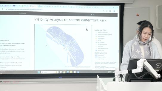
Seattle Waterfront
Authors: Yiling Xu, Yihao Xu, Chenyu Song
This project examines how Seattle’s central waterfront was transformed after the removal of the Alaskan Way Viaduct, shifting the shoreline from a car-dominated corridor into a publicly accessible civic landscape. Using GIS, the team reconstructs “before and after” conditions by defining a waterfront study area, integrating public-space features, building footprints and heights, and generating Digital Surface Models (DSMs) to represent the three-dimensional urban form that shapes what people can see. They then apply viewshed analysis from key landscape nodes (e.g., bridges, overlooks, piers, elevated walkways) to measure visual access to Elliott Bay and map how visibility changes across space, showing that post-viaduct views are no longer isolated glimpses but form a more continuous band along the shoreline, especially around elevated and open public spaces. The findings emphasize that improved visual access is not simply a function of distance to the water: it is produced by design features and blocked or enabled by surrounding building massing, with inland high-rises still creating a sharp visual boundary beyond the immediate waterfront. The project closes by noting practical limitations (incomplete building height data, simplified surface models that omit finer obstructions like trees, and a constrained 600m analysis buffer), while arguing that GIS-based visibility modeling offers a concrete way to translate “experience” into measurable evidence for waterfront planning and public-space design.