
When The United Nations Puts a Call Out to Data Pros...
Enrico Bertini’s Data Visualization Group Triumphs

Recently, Atefeh Riazi, the Chief Information Technology Officer for the U.N. issued a public appeal. “I invite the global community of data scientists to partner with the United Nations in our mandate to harness the power of data analytics and visualization to uncover new knowledge about U.N.-related topics such as human rights, environmental issues, and political affairs,” she wrote. To that end, the organization mounted a series of challenges, including one aimed at helping observers track the progress that countries have made in meeting Millennium Development Goals and another seeking ways in which to organize and highlight global humanitarian priorities.
Challenges were open to visualization experts from around the world and competition was exceptionally strong. It was thus particularly noteworthy that two of the winning entries came from a single institution—the NYU Tandon School of Engineering—and a single research group—headed by Assistant Professor Enrico Bertini.
Graduate student Cristian Felix won top honors in the U.N.’s #VisualizeChange: World Humanitarian Summit Data Challenge, which was mounted in the lead-up to the first-ever World Humanitarian Summit convened by the United Nations Secretary-General Ban Ki-moon. Thousands of stakeholders had shared their ideas to reduce human loss and suffering from crisis, resulting in a staggering amount of data. Felix’s task was to find a way to organize and convey the information in a visually compelling and understandable manner, and his solution was WHS Explorer, a platform that creates a “topic ring” containing a word cloud. The visualization allows a user to segment data by variables like topic or country. The size and color of the words contained in the ring indicate the frequency in which they appear in the source material and their relevance. Users can easily ascertain, for example, that Jordanian documents often contain words like girl, refugees and women; cooking fuel and energy are priorities in Congo; and Fijians mention natural disaster frequently.
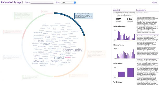
WHS Explore is a tool built by Graduate Student, Cristian Felix, to allow exploration of the World Humanitarian Summit dataset.
Felix, who earned his undergraduate degree in São Paulo before coming to NYU, was invited to Geneva, Switzerland, in October to showcase his work at a global conference. (His mother, he quipped, was single-handedly responsible for a sharp spike in viewership during the live-streaming of the event, since she had told almost everyone in Brazil to watch.)
Postdoctoral researcher Jeremy Boy, a graphic designer interested in storytelling through data, triumphed in the U.N. challenge to visualize the deluge of data generated in the race to meet the Millennium Development Goals, which include halving extreme poverty rates, halting the spread of HIV/AIDS, and providing universal primary education. The challenge (#WSD2015 Data Visualization Challenge) was inaugurated by the United Nations Statistics Division to coincide with World Statistics Day 2015 and followed the launch of the 2015 Millennium Development Goals Report.
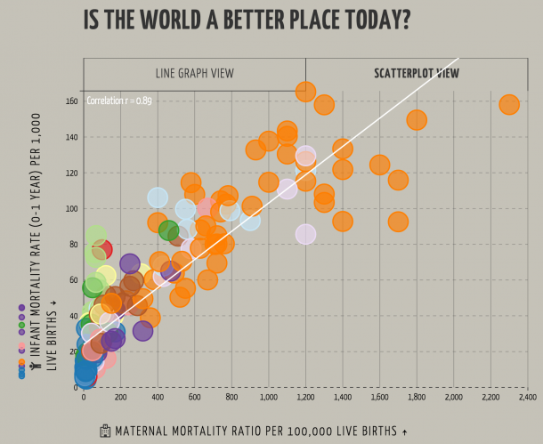
Postdoctoral researcher Jeremy Boy developed a web-based, interactive visualization app based on the Millenium Develoment Goals data
Boy, a native of France, created a Web-based, interactive visualization app that he dubbed “Is the world a better place today?” (or isWBPT) that allows users to choose a goal of importance to them (improving maternal health, for example, or eradicating hunger) and to track progress in a specific developing country or region.
Because he is deeply interested in “visualization literacy,” the ability to interpret and extract meaning from information presented in the form of an image (such as a graph or topic ring), Boy designed his platform’s demo as a step-by-step tutorial, which checks a user’s interpretation of the data at crucial points. (After viewing an interactive graph of relevant data, for example, a user might be asked, “Has Algeria reached its target goal of providing clean drinking water to inhabitants? If not, how likely is the country to meet its goals by the end of 2015?)
While it can be disheartening to discover that goals have not been met or that progress has been slow, Boy hopes users will be spurred to action by seeing the data in concrete, graphical form. “The app not only communicates information about the data, it also allows visitors to explore, and it shows them how,” he says. “This can lead to new insights, and maybe even new, crowd-sourced solutions for making the world a better place.”
“It is gratifying for me to see Cristian and Jeremy recognized on this global scale,” Bertini says. “Their dedication and the excellence of their work is proof that the NYU Tandon School of Engineering is fast becoming one of the premier centers of data visualization in the world.”


